Snacky Packy

Snacky Packy
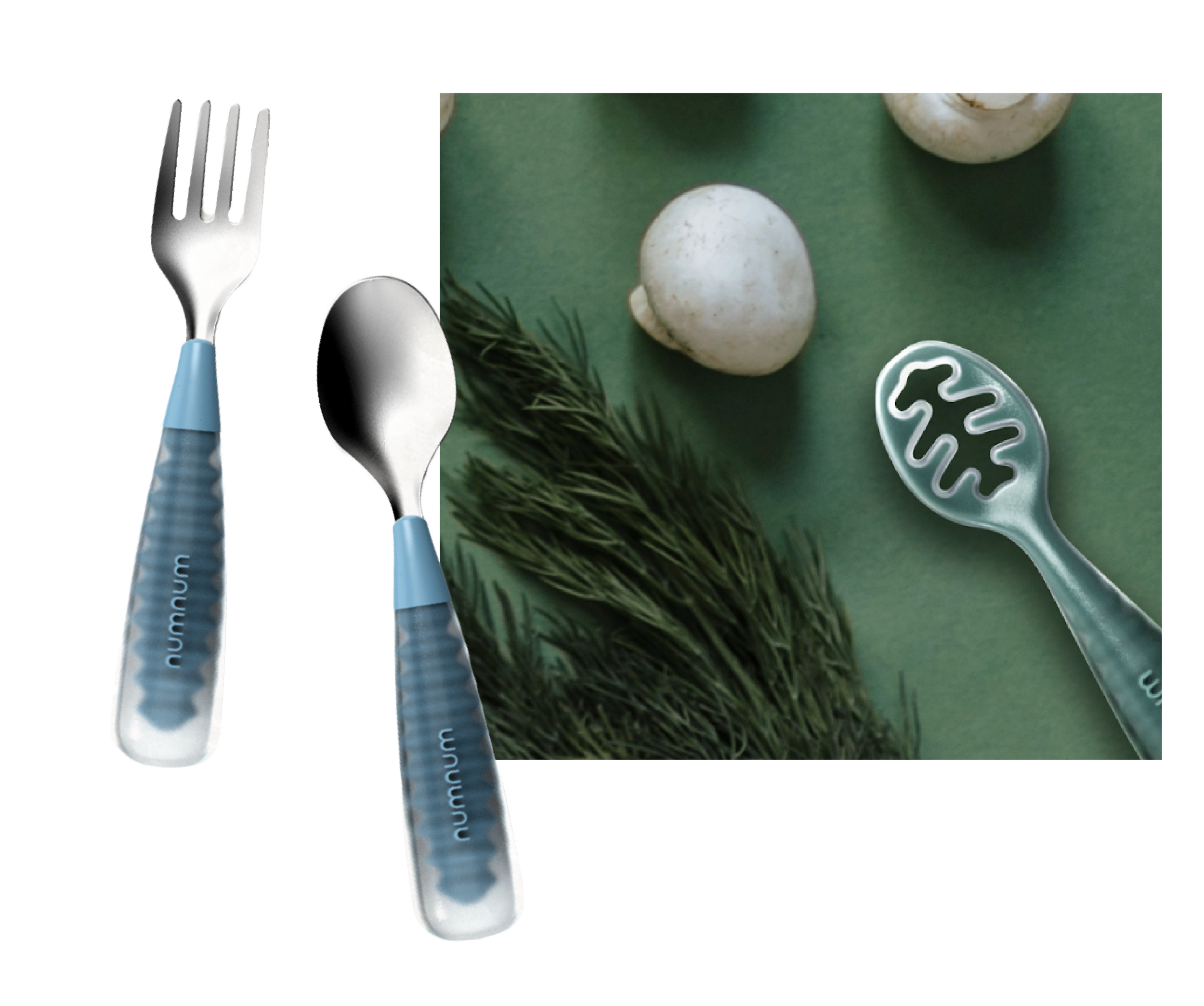
Palette development to expand a legacy collection for a children’s snack brand.
The brand: numnum
Industry: Children’s utensil brand improving the experience of young eaters
Type: CMF Design
Scope: CMF palette development to refine / expand legacy collection
Social media driven aesthetics spurred a backlash against primary hued toddler products, leading to a wave of “beige baby” goods that appealed more to parents than children. Goesling Group partnered with numnum to bridge the gap between sophisticated and youthful colors. We pulled inspiration from rising interior design and baby-led weaning foods to bring an inherited palette into a contemporary space.


Uncovering Generational Tastes

Cultural Landscape
Nostalgia and the rise of food as luxury are fueling a broader appetite for joyful, indulgent color. In tandem, lines between children’s and adult spaces are blurring, from shared interior palettes to the overlap of baby-led weaning and adult wellness trends.
Opportunity Gap
Competitive analysis revealed a category dominated by two extremes: bright primaries and muted neutrals, leaving little room in between.
By looking beyond utensils to the broader baby product landscape, we identified an opportunity for nuanced midtones and sophisticated saturation to bring a more distinctive and elevated approach to the brand’s palette.
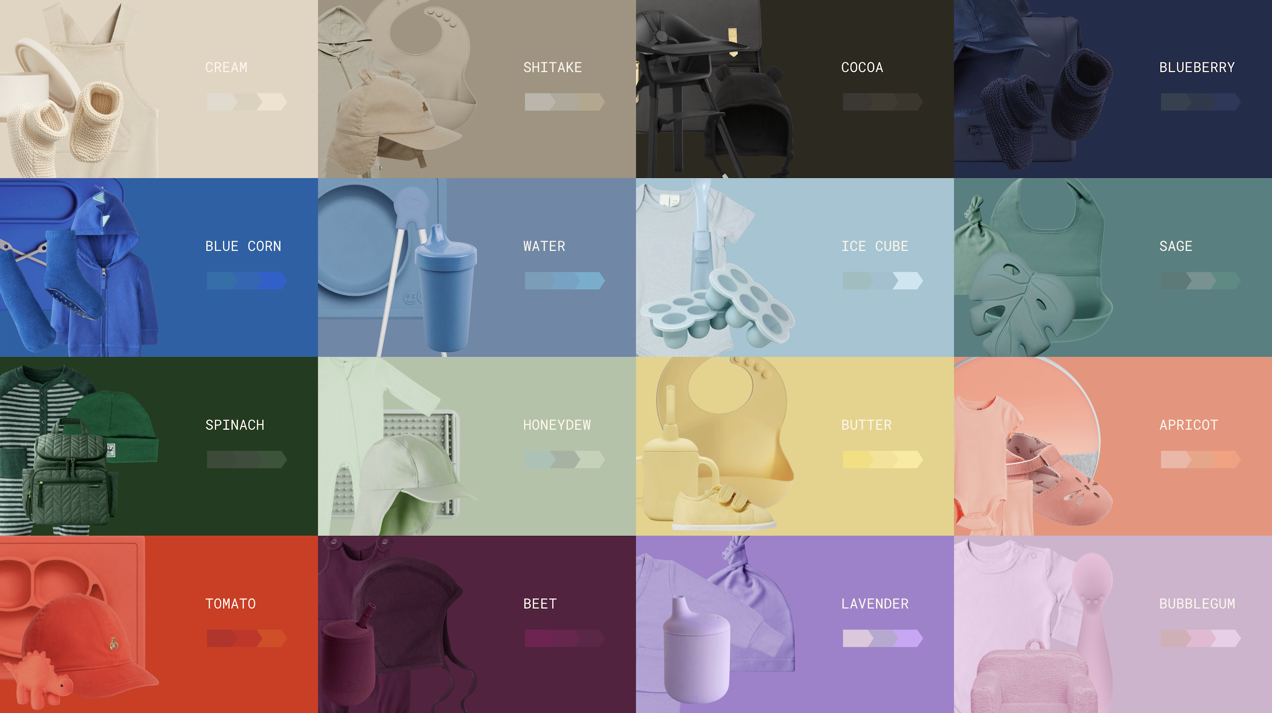
Color & Shade Strategy
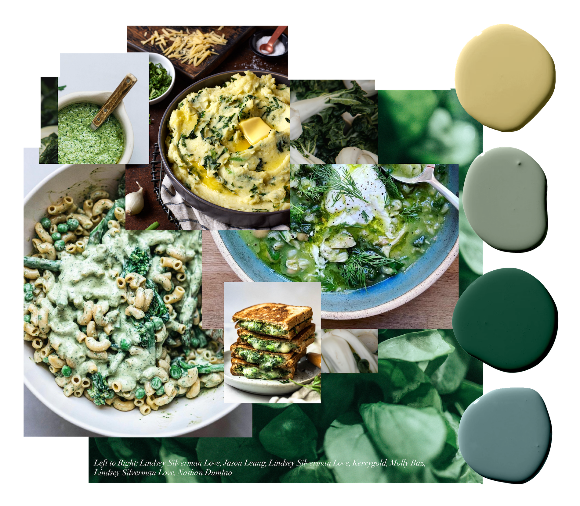
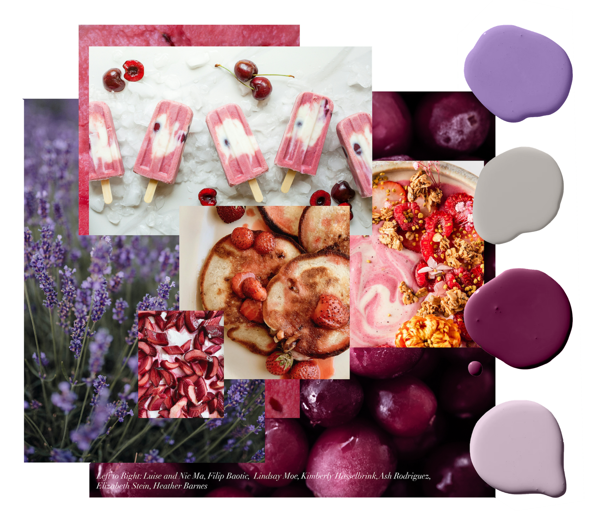
Individual hues were tracked and developed into a flexible palette of core and expansion colors, then grouped into story-driven collections inspired by first foods, including fruit salad, breakfast bowls, and creamed veg.
A strategic color cadence of carryovers, additions, and replacements created opportunities to refresh and expand the palette across products over time, while minimizing waste and production costs.